Cart 0

PRESENTATION DESIGN

The Creative Team of the Future is an annual digital publication and collaboration between AIGA and The Creative Group. Collaboration in the Workplace was a collaboration piece between the two industry leaders. This issue focused on 7 common challenges creatives face in the workplace. The main theme of this project was connections and communication. There are so many ways and tools to communicate, it was important to showcase them using a fun and bold aesthetic. The cover design is pulled throughout  the clean, light pages of the interior in a muted way, so the reader isn't overwhelmed. 
PRESENTATION DESIGN

This piece highlights the nature of Generation Z and how to successfully work with this young workforce. We focused on bold, clean colors and and delivered bite-sized content in order to set the campaign up for a successful social media presence. Supporting materials included infographics, email campaign, an online quiz and web banners.


PRESENTATION DESIGN

This global campaign focused on how to manage an amazing "Dream Team". The theme is focused on and uses sports team imagery as this piece was released during the World Cup. 


PUBLICATION DESIGN

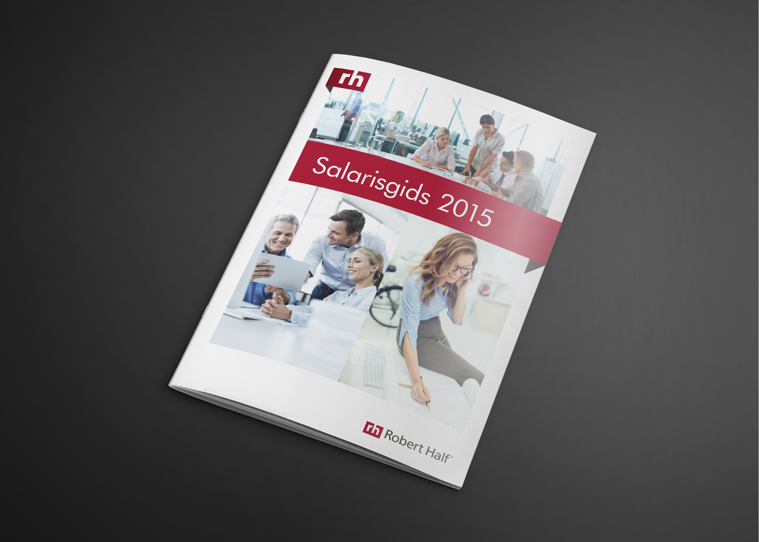
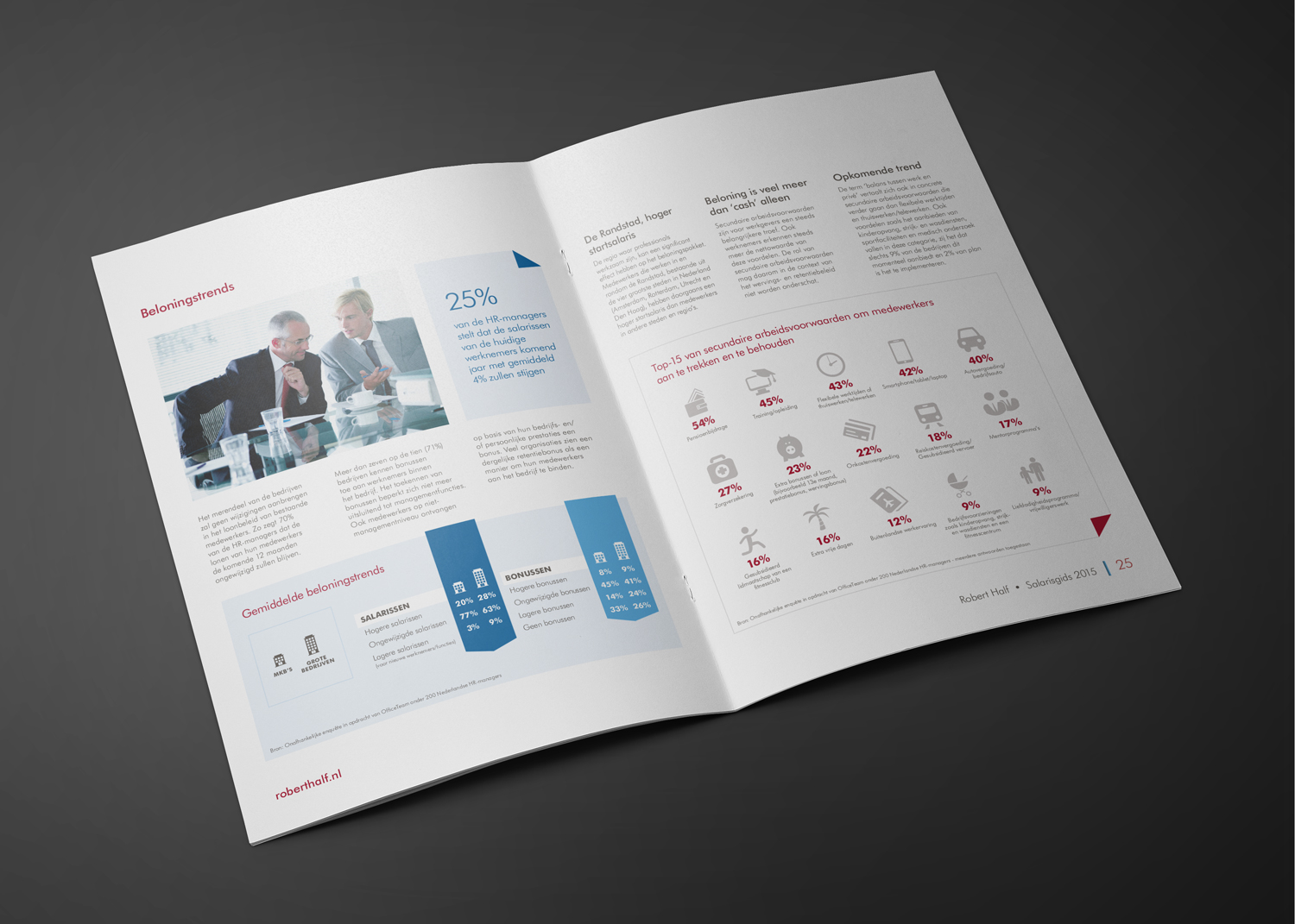
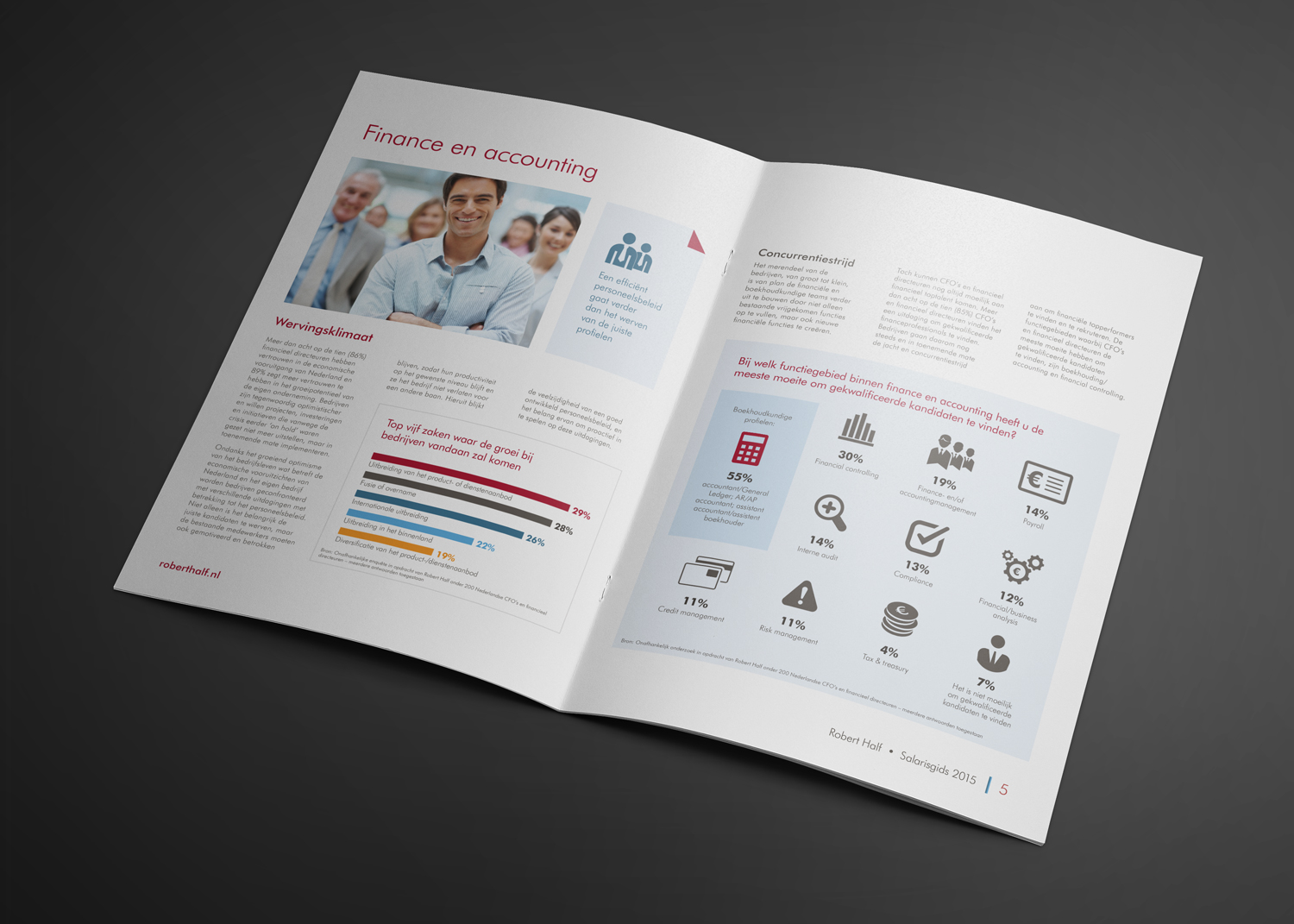
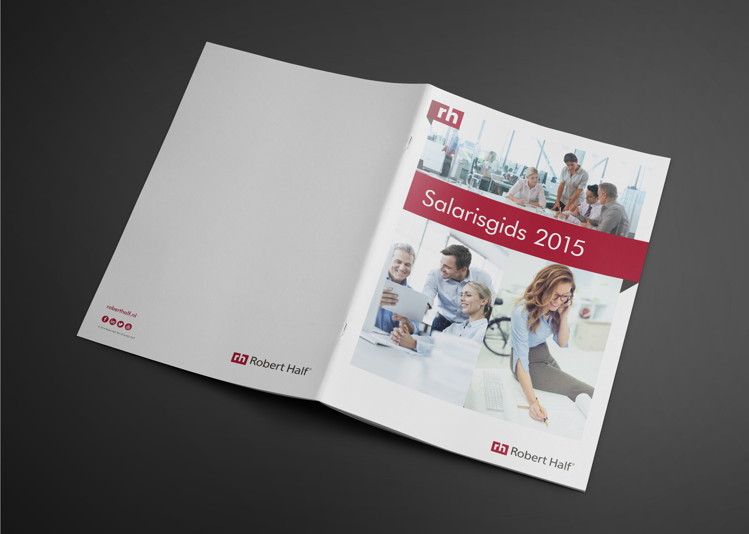
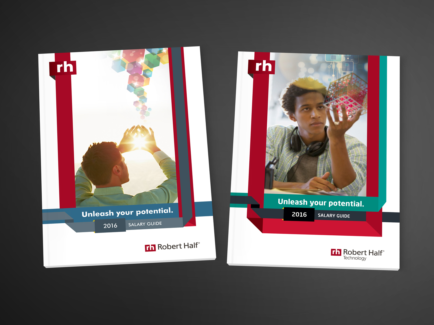
In order to firmly position Robert Half within the rocky international market, all lines of business where marketed under this new universal theme. The interior was designed using a clean and fresh aesthetic. Leveraging the brand colors to pop against a white landscape was essential in presenting bright and engaging content candidates and clients want to read.


PUBLICATION DESIGN

After the decision to move forward with the universal theme in North America, these cover concepts were designed for the international market.


PUBLICATION DESIGN

Following the success of the 2015 Salary Guide in international markets, North America decided to adopt the universal theme as well. These concepts introduced the idea to Robert Half decision makers and get clearance to move forward. The mock theme was "Unleash your potential." With the universal theme in place, I was able to show how each line of business would work within the universal theme and still proudly fly true to it's own brand.

BRANDING, IDENTITY & WEB DESIGN

Web examples of Ponaman Healthcare in browser on laptop, tablet and smart phone, bright yellow background.

ponaman.com

Open spread of Ponaman Brand Standards guide on gray background.

Brand Standards Guide Spread

Ponaman needed a new website, logo and stationery set. Using their existing dark blue, a brighter blue was added for a refreshing feel. Curved lines in logo mark symbolizes a net, catching 340B healthcare organizations, making them compliant and able to deliver high quality medical care to underserved populations.

BRANDING & IDENTITY DESIGN

TPT_sketch.png
free-greeting-card-mockupTPT1.jpg

Logo Thumbnail Sketches

Free-Brochure-MockupTPT.jpg

Brand Style Guide

Style Guidelines

Teapot Artwork

This brand needed to represent a classy, quality & non-traditional style with a modern flare. The timeless thick and thin lines of Didot, paired with the clean/modern Neutraface typestyle created the perfect environment to marry these two styles. The overall branding is very clean and classic, using white primarily with black as a secondary color and yellow as a primary accent.. Supporting splashes of color accent the brand palette to create interest and movement to guide you through the designs.

BRANDING, IDENTITY, MERCH & WEB DESIGN

BRANDING, WEB & PRINT DESIGN

Purple, red web examples of Bay Point Community All N One in browser on laptop, tablet and smart phone, bright yellow background.

baypointallnone.com

This poverty alleviation non-profit needed strong online presence to aid in grant application and to help bring awareness to a wide array of urgent services and information for those in need, to take donations and report on events and projects. Purple as primary color represents a deep dignity of those in need. As secondary colors, red represents a passion for serving the community, while orange symbolizes joy of helping and encouragement to help each other thrive. Branding was implemented across all popular social media in order to create trust and loyalty with the orgnization.

PRINT & WEB BANNERS

POSTER

POSTCARD

CONCERT PROGRAM COVER

WEB BANNERS


POSTER

POSTCARD

SUNDAY PROGRAM COVER

WEB BANNERS

Color and illustration were the key components in this two part concert series for First Presbyterian Church of Berkeley. Part one uses a vibrant gold to symbolize not only the birth of the Messiah but to convey a Christmas feel, as it was held in December. Part two carries the holy gold color into a burst of magenta symbolizing the life, passion, death and resurrection of the Messiah in part two which coincides with Palm Sunday. Both illustrations were sourced and licensed from the original artist. Colatteral included posters, program covers, postcards and web graphics.